![]()
TerraViz is an interactive map visualization web-app that shows the immediate effects of climate change. Our vision is to make climate change tangible!
Quick Links
This project evolved inside TechLabs: A learning accelerator for technology skills. In a 4 months blended learning journey young individuals learn state-of-the-art tech skills and apply them in a group project.
- DS Bastian van der Put
- DS Florian Deters
- DS Lukas Hoppe
- WD Seong-eun Kim
- WD Timea Varju
- Figma - We used Figma for our initial exploration and ideation phase and later on for our styleguide and high-fidelity design.
- Notion - We used Notion to structure and manage our product development process. There, we always had access to our most important links, collected the ressources we would need and we had a place to write our updates and about our project.
- Slack - The TechLabs community uses Slack for everyday communication. Hence, we had our own group in which we shared project status, split work and discussed designs, tech implementations and product decisions.
| Figma | Notion | Slack |
|---|---|---|
 |
 |
 |
We depicted, that making the future of our planet tangible is one of the psychological barriers that have made climate change into an elusive problem. People fail to call for immediate action, because they can’t see and feel the immediate effects of it: Climate change is too abstract, too far away.
Thus, our vision was to make climate tangible and build something that would clearly show how our planet is getting warmer every year. Our first approach was to display past and present occurring wildfires as an immediate result of climate change. However, we then decided to tackle the overarching problem itself - Climate Warming - to increase awareness by displaying the severity of it. Thus, we created a web application that displays the global temperature development over the past century. With an interactive map visualization we show climate warning for all major cities around the world.
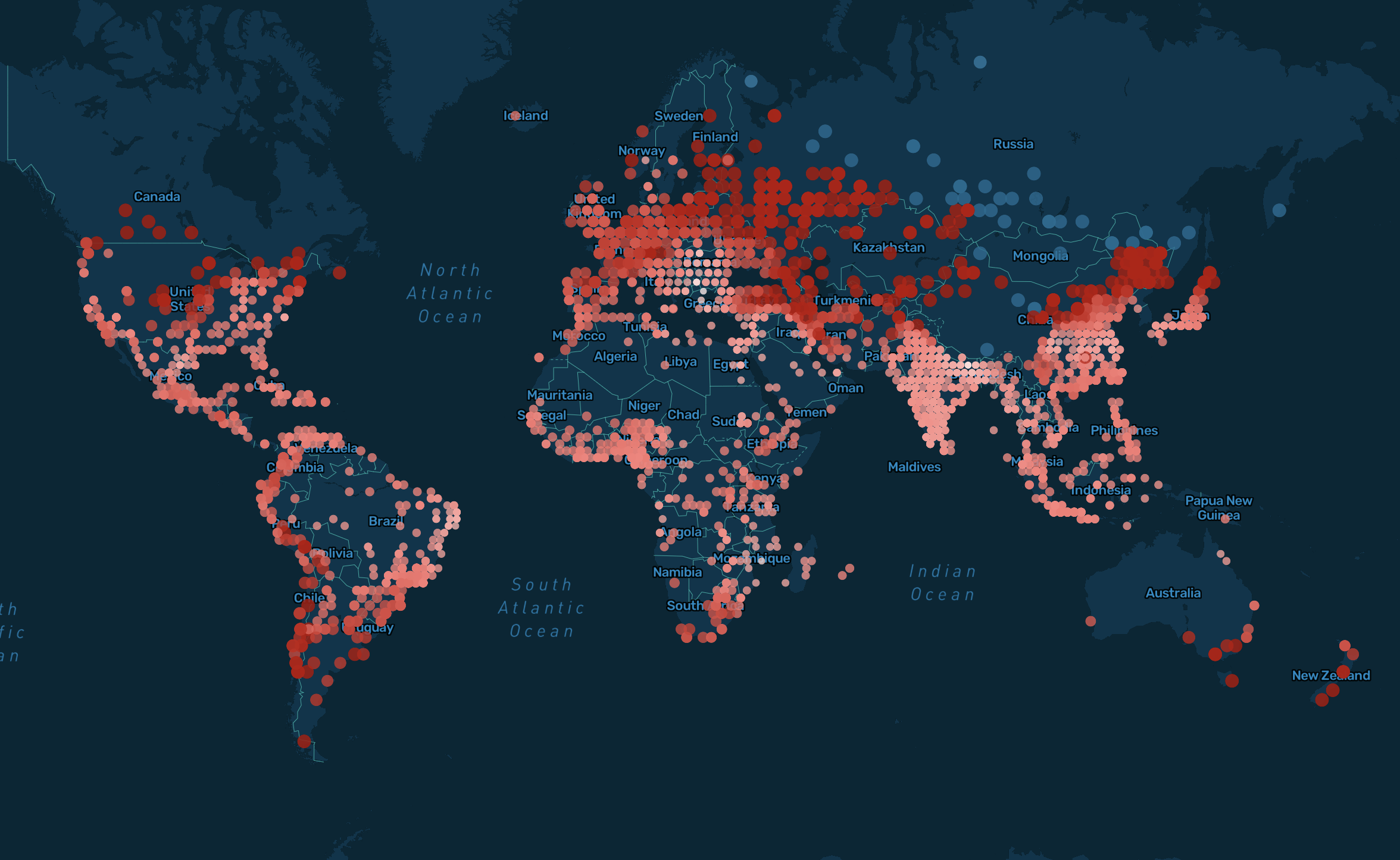
Heating Up
Sliding through the time from 1900 until 2013 shows the immersive effects of climate change already present in todays world - and especially, how they’re getting more severe by time. In the first half of the twentieth century, warmer periods are followed by colder ones in quite a constant exchange. With the end of WWII, the situation begins to worsen. Less colder periods occur. Warmer periods start to dominate. The last period of cooling temperatures ends somewhat around 1942. From that point onwards, there’s only one way on the temperature scale: upwards. By 2013, there are only very few blue dots left, somewhere in continental Asia. The rest appears in dark red, signalling a temperature increase of more than 7.5% over the course of 100 years. In fact, the average temperature increase across all locations in 2013 is at almost 14%. Only in 7 years of the 113 year timespan, the world is cooling down on average. All of these years occur before 1942. There’s an alarming trend apparent.
Different areas, different heat
The closer one gets to the equator, the more stable the climate is. Temperature is more volatile at locations of higher proximity to the poles. While this means that there are more periods of cooling down here, it also means that the heat is more severe - with enormous consequences for world climate. The poles act as a natural air conditioning - their faster disappearance causes severe damage to the balance of the worldwide climate system.
-
Clone repo.
git clone https://github.com/TechLabs-Berlin/st21-terraViz
-
Navigate into folder.
I. Navigate into the site’s directory:
cd st21-terravizII. Navigate into the frontend folder:
cd frontend -
Install dependencies and scripts
npm install
-
Start local development server
npm start
-
Open browser
The site is now running at
http://localhost:3000!
The site is deployed on Netlify
main: development branchlive: production branch