Been using gmail-logger to collect data about your Gmail inbox, and want to generate graphs like those in my blog post, Three Years of Logging My Inbox Count? Perfect, because that's all this repo does.
Fair warning: a lot of this code is inelegant. Don't study it as an example of how to do Pandas/Matplotlib right.
Make sure you have ipython, pip, and virtualenv installed.
git clone https://github.com/mddub/gmail-graphs
cd gmail-graphs
virtualenv venv && . venv/bin/activate
pip install -r requirements.txt
ipython notebook --pylab inline
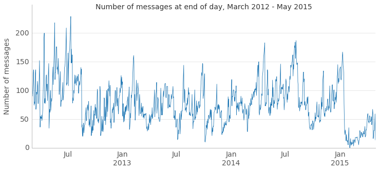
Follow the Inbox count over time IPython Notebook.
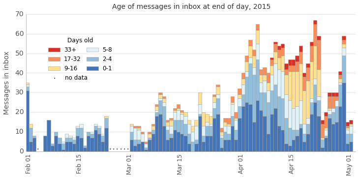
See compute_ages_on_each_day.py and the Inbox count by age IPython Notebook to graph the results.
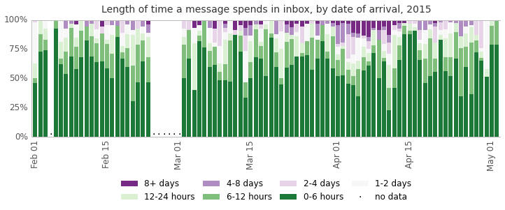
See compute_time_in_inbox_by_date_received.py and the Length of time a message spends in inbox IPython Notebook to graph the results.
I've tried my best to generalize this code to run against anyone's gmail-logger data, but I can't foresee how well others' data will play with it. If you run into issues, please file an issue. If you have enhancements, pull requests are welcome.